Colorblocking is not decoration. It is architecture. It takes two or more colors, places them side by side, and creates a visual structure that shapes how the garment is seen and how it shapes the body within it. When that structure is rendered in high-gloss latex and framed by a dramatic high collar, the result is something rare: a dress that uses color as a structural element, not just an accent.
A colorblock high collar latex dress is a garment designed to be read. The boundaries between colors draw the eye. The contrast creates movement. The high collar frames the face and anchors the composition. This guide explores the visual language of colorblock latex—how to read it, how to choose it, and how to wear it as the statement it is meant to be.
Key Takeaways
- Colorblocking on latex uses contrast as a structural element, shaping how the dress is perceived.
- The high collar anchors the composition, framing the face and connecting the color story.
- Color placement—vertical, horizontal, or asymmetric—changes how the dress interacts with the body.
- The choice of color combination defines the mood: graphic, dramatic, soft, or bold.
- With proper care to prevent color transfer, a colorblock dress remains a striking statement piece.
The Language of Colorblock on Latex
Latex changes how color behaves. Its glossy surface reflects light, making colors appear more saturated than they would on matte fabrics. A red panel on latex glows. A black panel absorbs light, creating depth. When these colors sit next to each other, the boundary between them becomes a line of tension—a place where the eye stops and the conversation between hues begins.
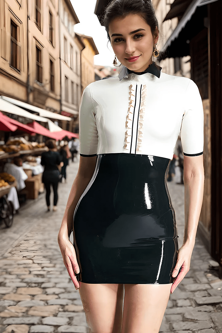
On a high collar dress, that conversation is anchored by the collar itself. The collar frames the face and, depending on its color, becomes the starting point from which the rest of the composition unfolds. A white collar against a black body creates stark, graphic contrast. A red collar against blue introduces warmth and energy. The collar is not just a neckline—it is the first note in the visual symphony.
The Role of Contrast
High-contrast combinations—black and white, black and red, navy and cream—create visual drama. The boundary between colors is sharp, deliberate, impossible to ignore. These dresses demand attention. They are for moments when you want to be seen, remembered, and unmistakably present.
Low-contrast combinations—soft pink and cream, dusty blue and lavender, charcoal and black—create a more subtle effect. The boundaries blur. The colors blend and shift depending on the light. These dresses reward close looking. They are for wearers who want the structure of colorblock without the volume of high contrast.
The Movement of Color
A colorblock dress is never static. As you move, the relationship between colors shifts. Light hits different panels at different angles. The boundaries between colors seem to move. A vertical panel that looked slim from the front may widen as you turn. A horizontal band that defined your waist may shift as you sit. This movement is part of the design—the dress is meant to be seen in motion, not just standing still.
The Architecture of Placement
Where the colors are placed determines how the dress reads on your body. The same two colors arranged differently create entirely different effects.
Vertical Panels
Colors arranged in vertical panels—a dark panel on the sides, a lighter panel down the center—create an elongating effect. The eye follows the vertical lines from collar to hem, lengthening the silhouette. This placement works with the high collar’s natural upward pull, creating a continuous visual path that draws the eye from your face down through the dress.
Vertical panels also allow for subtle shaping. A darker color on the sides can visually narrow the waist. A lighter color down the center can draw attention to the midline. These are not tricks—they are the language of color used deliberately.
Horizontal Bands
Colors arranged in horizontal bands break the body at specific points. A band at the waist emphasizes that point. A band at the hips creates a different proportion. Horizontal bands work best when placed with intention—the band should align with the body’s natural lines, not fight against them.
On a high collar dress, a horizontal band at the chest or shoulders can create a color boundary that frames the collarbone area, adding visual interest to the upper body. This placement draws attention to the high collar and the face it frames.
Asymmetric Design
Asymmetric colorblock—one sleeve in a different color than the body, a diagonal panel cutting across the torso—creates dynamic, unpredictable compositions. The asymmetry disrupts the eye’s natural tendency to seek balance, forcing it to move across the dress in unexpected ways.
These designs work well for wearers who want something modern, artistic, and visually active. The high collar, with its inherent symmetry, provides a stabilizing anchor against the asymmetry below.
The Collar as a Color Element
The high collar itself can be a colorblock element. A collar in a contrasting color frames the face directly, creating a focal point that changes how the rest of the dress reads. A white collar on a black dress creates sharp, graphic framing. A red collar on a blue dress adds warmth and energy to the face.
Because the collar sits so close to the face, its color interacts with your skin tone, hair color, and any makeup you wear. This is worth considering when you choose your color combination—the collar color will be the one that sits closest to your face, the one that becomes part of your portrait.
Choosing Your Color Story
The colors you choose for a colorblock dress define its mood. Each combination tells a different story.
Black and White: Graphic Clarity
Black and white together on latex is stark, timeless, and unmistakably graphic. The white reflects light; the black absorbs it. The boundary between them is a line of pure contrast. This combination works in any setting—formal events, editorial shoots, or simply the pleasure of wearing something that feels clean and deliberate.
Black and Red: Dramatic Heat
Red against black on glossy latex creates visual fire. The red seems to glow against the depth of the black. This combination carries weight—it suggests passion, power, and presence. It is not subtle, and it does not try to be.
Blue and White: Cool Sophistication
Blue and white together evoke clarity and calm. On latex, the combination takes on an unexpected edge—the softness of the color pairing contrasts with the material’s boldness. This works well for wearers who want color without the intensity of red or the starkness of black and white.
Bold on Bold: Unapologetic Energy
Some colorblock dresses pair colors that compete—red and blue, orange and purple, yellow and green. These combinations are for wearers who want the dress to be loud, energetic, and impossible to ignore. The result is maximalist, vibrant, and deliberately unsubtle.
Monochromatic Depth
Even a single color can be colorblocked. Different shades of the same color—deep burgundy with lighter wine, navy with royal blue—create subtle, sophisticated contrast. The effect is more restrained than high-contrast combinations but adds depth and visual movement without competing for attention.
Dressing and Care for Colorblock
A colorblock dress requires the same dressing technique as any latex garment, with attention to the color boundaries.
Dressing
Apply silicone dressing aid to clean, dry skin and the interior of the dress. Use the rolling method: turn the dress inside out, roll from hem to collar, step in, and unroll slowly with your palms. When smoothing, ensure the seams where colors meet lie flat—any twisting will show immediately in the color boundaries.
Preventing Color Transfer
The primary care concern for colorblock latex is color transfer. Dark panels can bleed into light panels, especially when the dress is warm or stored improperly. To prevent this:
- Clean the dress immediately after each wear. Oils and residues at the color boundaries can accelerate transfer.
- Store in a cool, dark place. Heat and light encourage color migration.
- Dust with white talcum powder before storage.
- Use acid-free tissue paper between colored panels if folding.
- Keep away from other garments, especially light-colored latex.
Cleaning
Rinse with cool water. Hand wash in lukewarm water with latex cleaner. Rinse thoroughly. Pat dry and hang on a wide, padded hanger away from sunlight. If transfer occurs, wash immediately—stubborn transfer may require specialized cleaner.
FAQ
What color combination is most versatile?
Black and white offers the most versatility. It reads as graphic and modern in creative settings, sophisticated and elegant in formal ones. Black and red is more dramatic; blue and white is cooler and calmer. Choose based on where and how you plan to wear the dress.
How do I know if a color combination works with my skin tone?
The color that matters most is the one near your face—typically the collar. If the collar is a color that flatters your skin tone, the rest of the dress will follow. Consider your undertones: cool tones pair well with jewel tones and true whites; warm tones pair well with earthier shades and off-whites.
Can I wear a colorblock dress to formal events?
Yes. Choose a sophisticated combination—black and white, navy and cream, burgundy and black—and style it with simple accessories. The high collar adds structure that reads as elegant rather than casual.
How long will a colorblock dress last?
With proper care—cleaning after each wear, storing in darkness, using tissue paper between colors—a quality colorblock latex dress can last 5–10 years. Color transfer is the primary risk; careful storage significantly extends its lifespan.

Leave a comment